
The metrics tab for a resource has 4 main sections highlighted in the image below: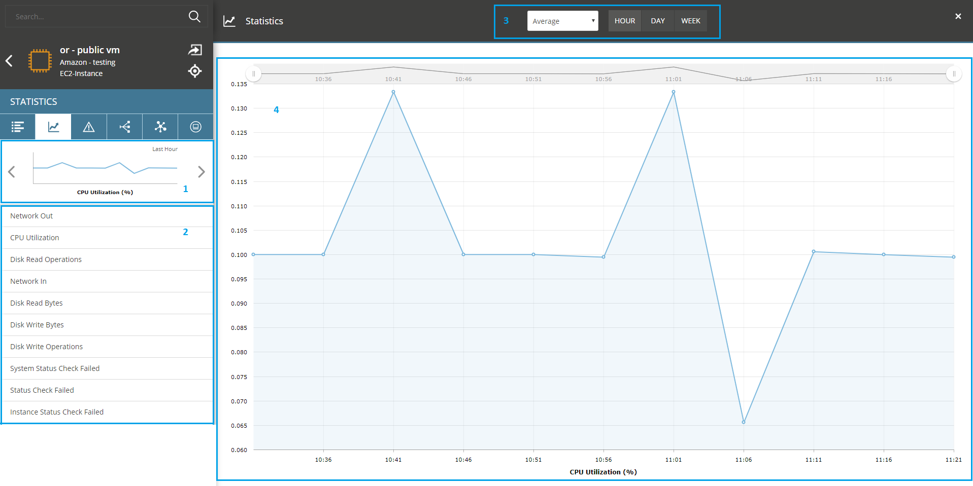
- Sparklines - Displays some convenient metrics as miniature sparkline charts. Clicking on one of the latter will load the chart in a larger dialog.
- All available metrics for the resource. Clicking on one will display the metric chart.
- Controls for time window and aggregation period allow you to change the rollup (Average in this example), as well as changing the Time range between hour, day or week.
-
The chart. You can zoom into a particular datapoint, select a specific range of time and get feedback as you hover over the datapoints.
