
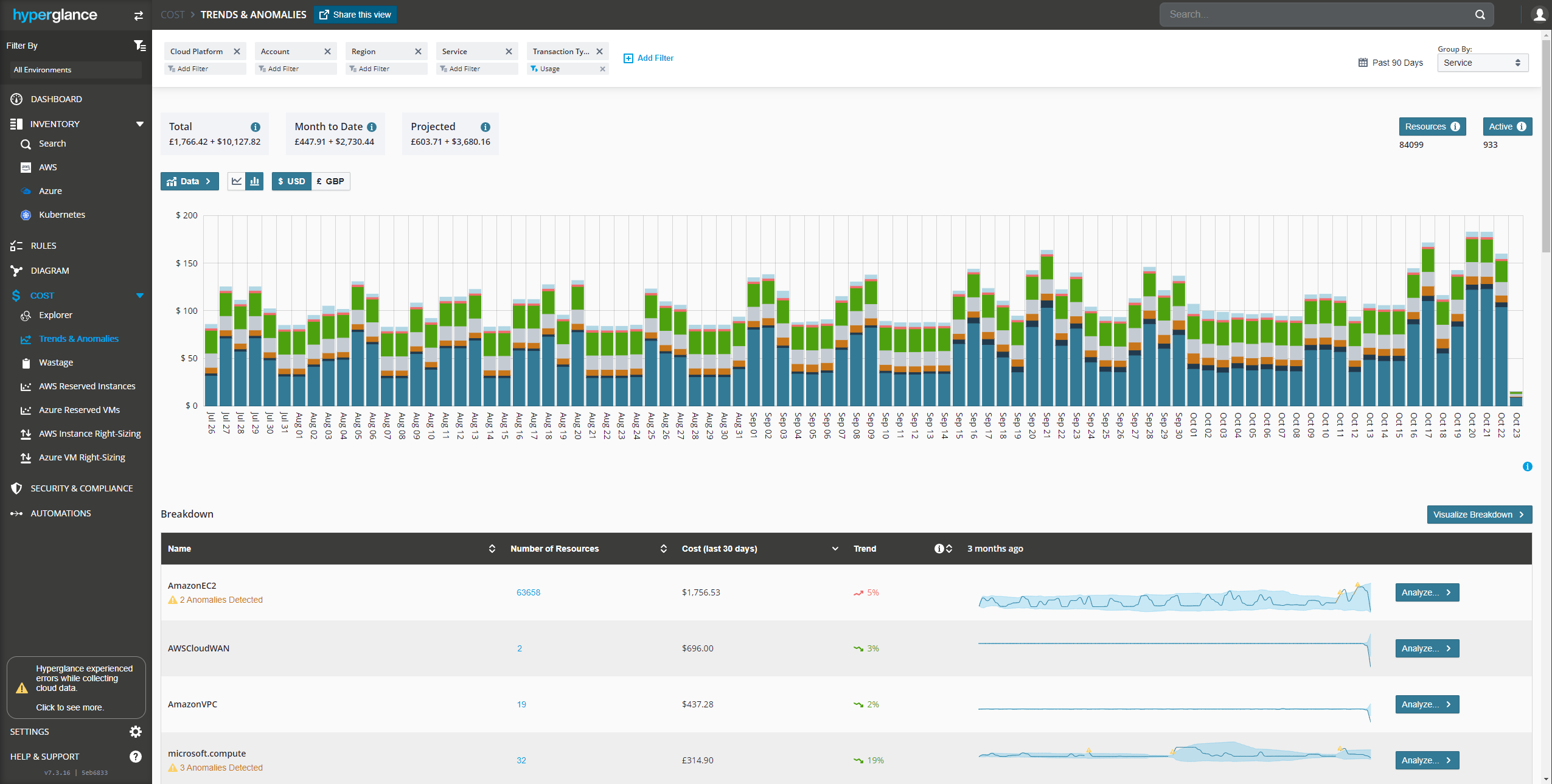
Use Hyperglance's Trends & Anomalies page to explore how your cloud spend has been trending over the past year.
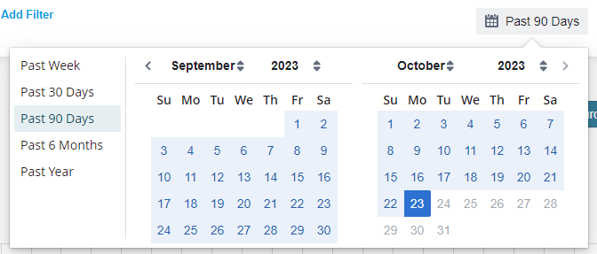
Time Range and Group-By
Use the timeframe picker to select a span of time:
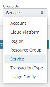
And decide on a way to breakdown your billing data:
The resulting chart displays your spend by (in this case Service) over the timeframe (in this case 90 days):
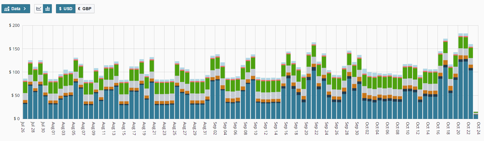
Main Chart Options
Use the Data button to add or remove plots from the chart (up to 6). All remaining spend that is not explicitly added to the chart is aggregated into an "Other Costs" option that you can choose to show/hide on the chart: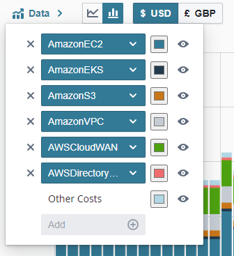
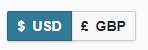
Use the currency switcher to view a particular currency. This will only show if you have multiple currencies in your dataset:
Toggle the chart between a bar or line graph:

Filtering the Data
Filtering is achieved across the top of the page:

By default some filter categories are included but only Transaction Type = Usage is applied as an active filter.
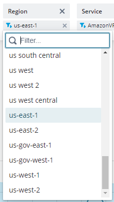
You can interact with an existing filter category to add one or more filter values to it. For example to filter by region:
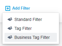
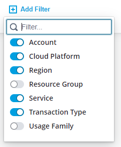
You can also add more filter categories using the Add Filter button:
Dimension Filters
Dimension filters are our standard cost dimensions that you can use to filter by:
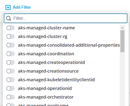
Tag Filters and Business Tag Filters
These filters allow you to filter by cloud tags:
If you have configured Hyperglance Business Tag normalization then you can filter by normalized tags too.
For tags to show here they have to be in the billing data cost exports.
For AWS you may need to go into the billing console and setup tags to be exported to the cost exports
Breakdown Table
The breakdown table shows a detailed view of all the billing data that matches the filters, including any anomalies that have been detected:
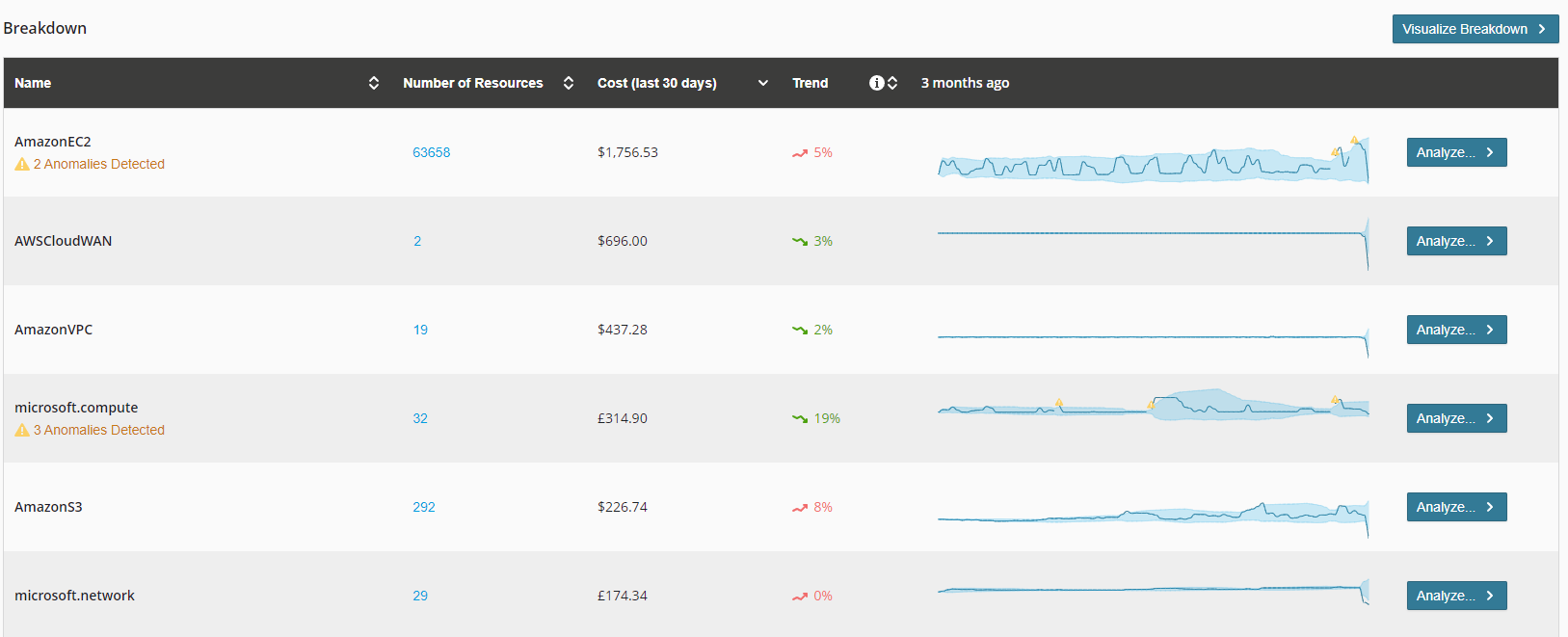
- Name Column - The name of the cost dimension (e.g. Service) as chosen using the Group By dropdown at the top of the page. The number of anomalies are also shown in this column, if any.
- Number of Resources Column - A count of unique resource IDs that have contributed towards this spend over the full span of time selected.
- Cost (last 30 days) Column - How much this service has cost you in the past 30 days to present-day. Only shown if the chosen timerange covers the past 30 days.
- Trend Column - How much the service has cost you the previous 60 to 30 days. Only shown if the chosen timerange covers the past 60 days.
- Sparkline chart Column - A sparkline of your cloud spend so you can easily inspect if costs are going up or down. Anomalies are highlight on this chart to.
- Analyze buttons - Click on Analyze to add a filter to the top of the page that effectively filtered-in on the selected data. This will also allow you a closer look at those anomalies.
Anomalies
Anytime you filter down to a single plot element, usually by clicking an "Analyze" button the line-chart will display anomalies as well as upper and lower expectation bounds:
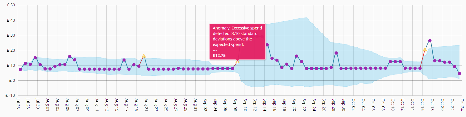 These charts help you spot unusual spend activity or help to pinpoint when changes may have taken place that impact your cloud expenditure.
Want to get alerted to these anomalies? Read how.
Got Feedback?
We're sure you want to do more with our cost and anomaly tooling. Why don't you send us your feedback and influence our roadmap?
Hit us up on our website chat or send an email to: 